Case Study: Playful Logo Captures Spirit Of The Treehouse Reading and Arts Center—Winning National Award
Challenge
Create an identity that captures imagination, creativity, learning and growth.
Solution
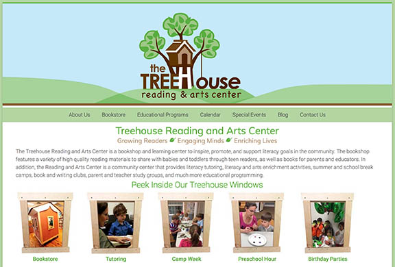
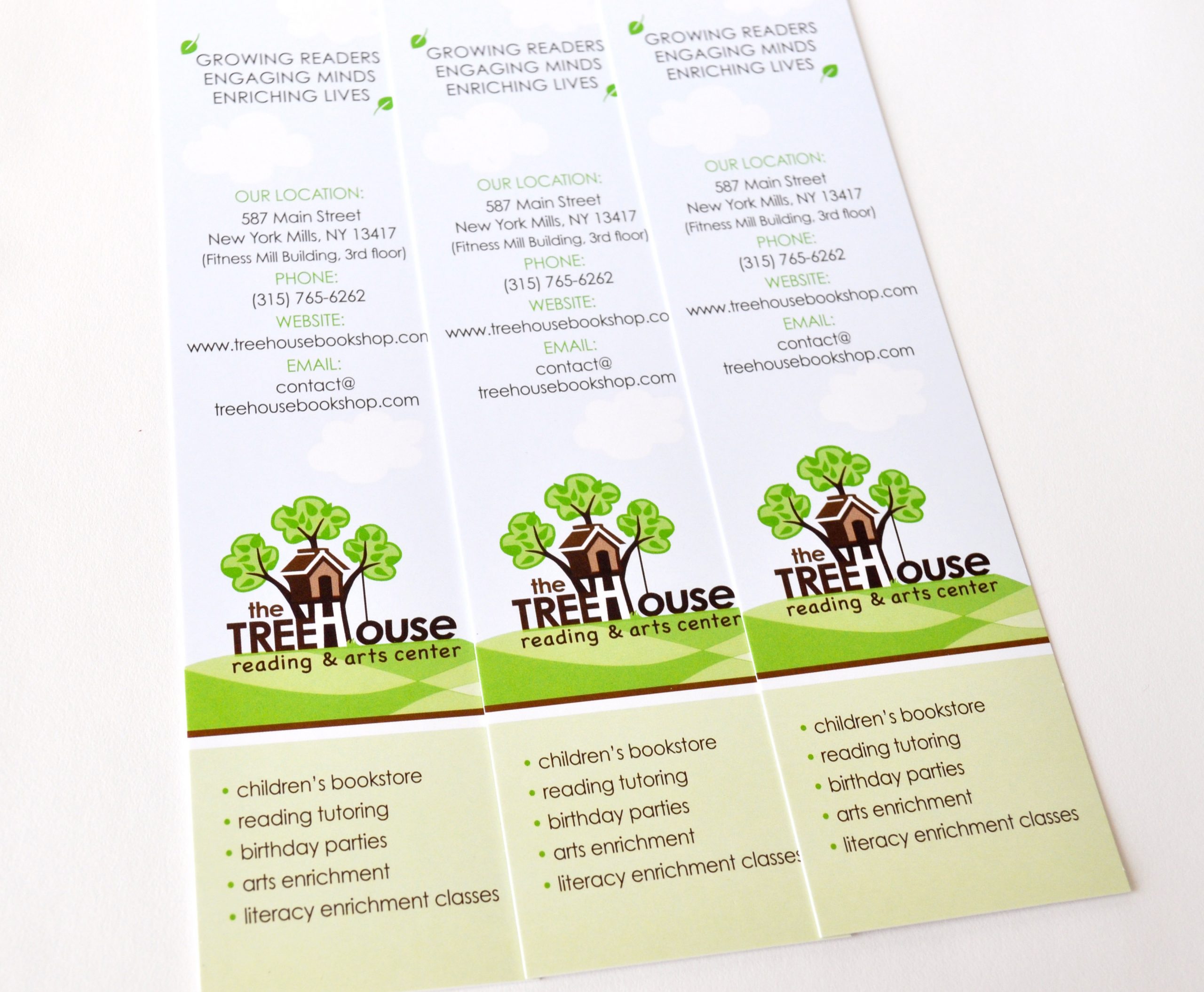
A treehouse alone is fun, playful, and symbolic of a child’s favorite playing space.
Capturing the spirit of this symbol required adding enough detail to communicate a treehouse, while keeping the logo simple and definable.
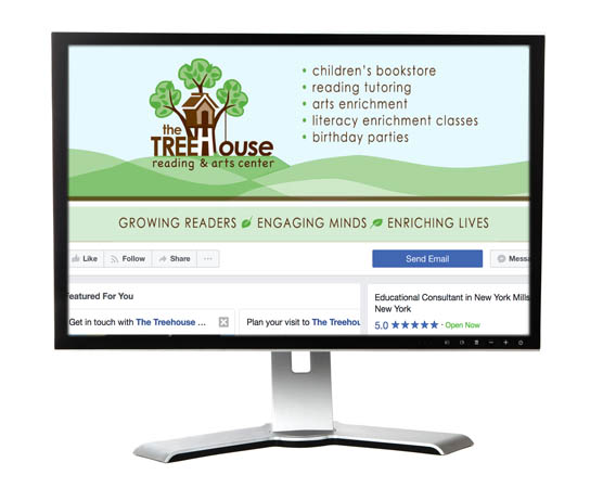
For brand colors, this was an easy pick of green and brown to symbolize nature and growth—like childhood learning and advancements. The rolling hills with it’s mix of shaded green pastures adds a whimsical feel to the brand’s identity. The playful tire swing keeps the graphic cheerful and fun.
Results
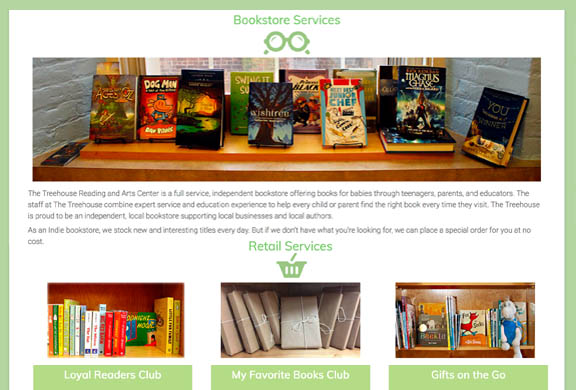
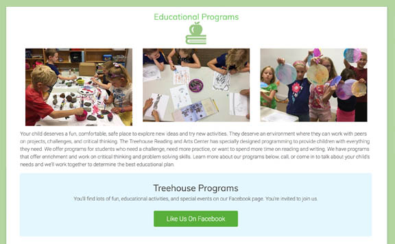
With an identity that is unique and recognizable, their promotional material will only increase their educational services within the community. This is where creating an identity, can reap the benefits associated with owning an exclusive identity that stands out.
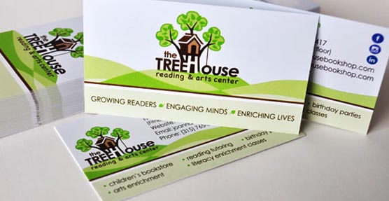

In 2018, Graphic Design USA, a trade publication for graphic design professionals, recognized IntreXDesign for the creation of the Treehouse Reading and Arts Center Logo. As a recipient of the award, the logo was printed in their 200-page GDUSA Design Annual.
For a deep dive into creating this identity read our blog article entitled, Case Study: Treehouse Logo.
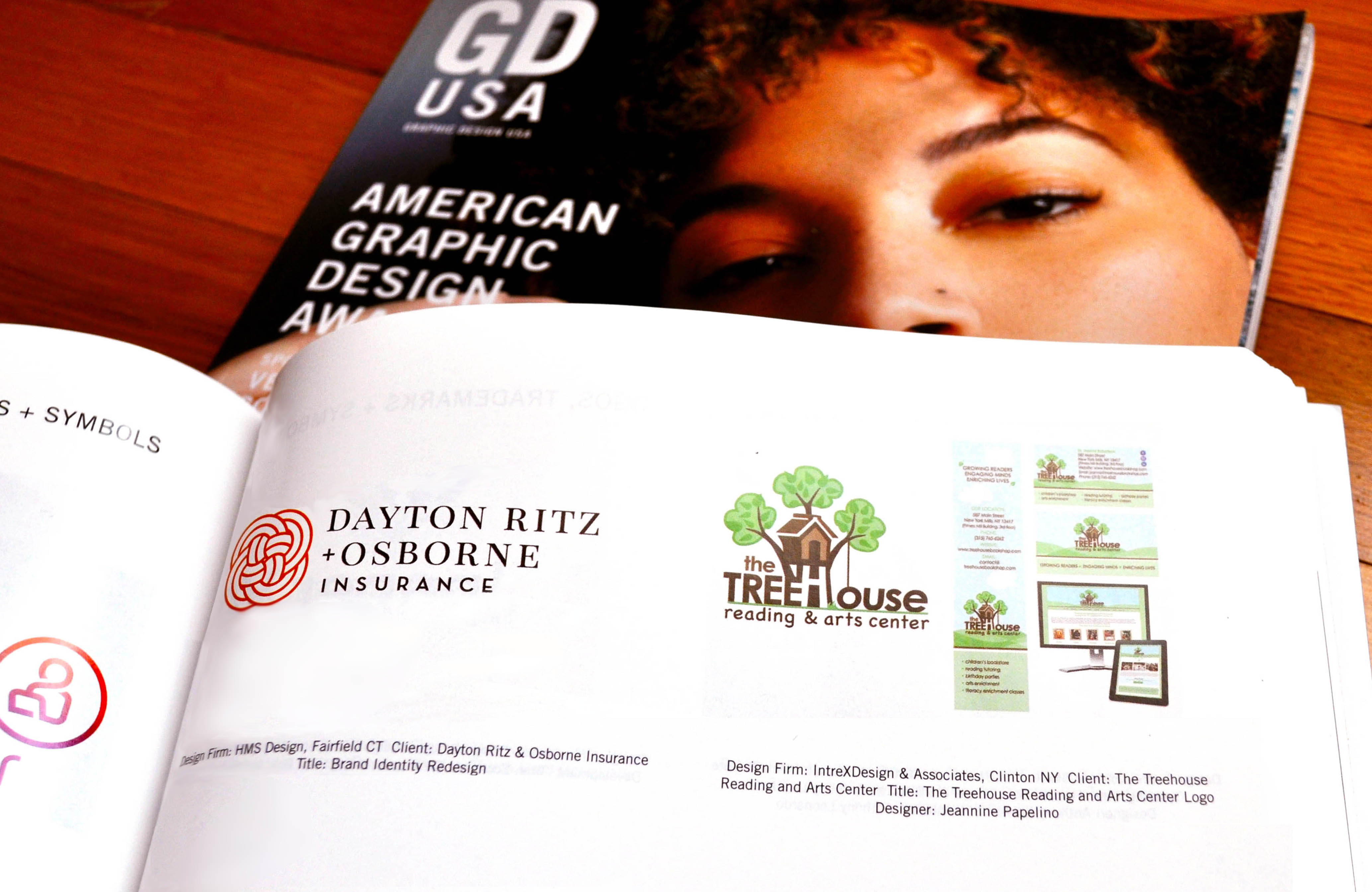
Graphic Design USA Magazine