Case Study: Combining Navy Roots With Medicine
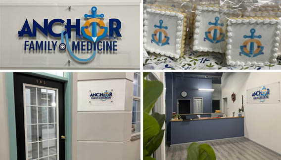
The Result: Anchor Family Medicine Logo
Challenge
The client’s request, create a graphic that ties his navy roots and medicine into one identity. IntreXDesign was hired to create and explore how the anchor could be married with medicine to form a unique identity. Before moving forward, there’s one more thought the client felt needed to be mentioned. Given a stethoscope is a common medical symbol, he dismissed using this element as part of his identity.
Solution
A few different anchor options were explored. But the graphic seemed to resonate more with navy and sea, than with medicine. A broader exploration of a medical graphic included elements like a family, a plus-or-aid-like symbol, and (yes) a stethoscope. Tying medicine and navy together was not an easy task. The typeface would need to be bold and convey a sense of strength, security, and stability to support the anchor graphic.
After many refinements IntreXDesign tied the stethoscope into the bottom portion of the anchor to create a unified graphic (thus marrying medicine and navy as one). Now, proposing this option to the client, with a few other concepts was our next task.
Results
When each identity was presented to the client two strong possibilities emerged. One of those options happened to be the anchor and stethoscope. There was something about this one the client really liked. But one alteration needed to be made. The letter “o” in “Anchor” was made to look like a life preserver. Once seeing the revised graphic, the client responded, “You convinced me.” He liked the way both elements captured medicine and navy together and it was unique enough to be different than other practices.
IntreXDesign selected the colors of navy blue and teal to tie back to his navy roots. The life preserver is symbolically colored orange to represent safety and security. This added element captures the genuine compassion, this practice has towards their patients.
Overall the challenge of this identity came together purposely, and the uniqueness of this logo allows this new practice to capitalize on its brand identity.
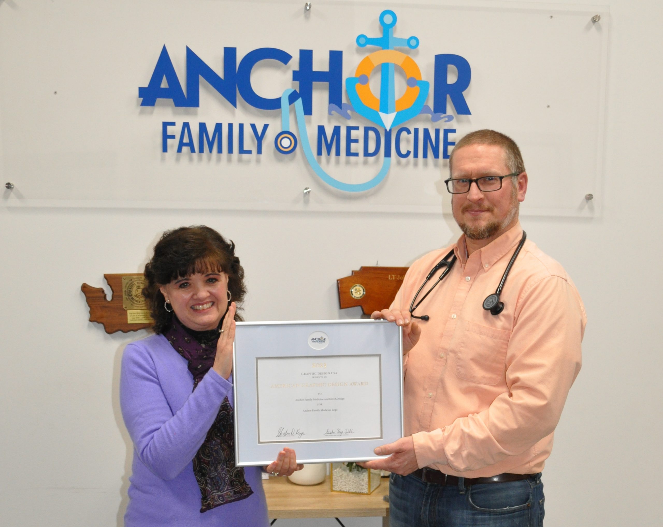
“I’ve had so many people complement us on the logo, even those who work in the industry.”
—Anchor Family Medicine

In 2023, Graphic Design USA, a trade publication for graphic design professionals, recognized IntreXDesign for the creation of the Anchor Family Medicine Logo. As a recipient of the award, the logo was printed in their 200-page GDUSA Design Annual. IntreXDesign thanks Graphic Design USA for this recognition.
Anchor Family Medicine Logo Recognized Among Best Designs
DesignRush, a leading trends and awards platform that recognizes outstanding projects and industry leaders, has recognized the Anchor Family Medicine logo in their article entitled: The Best Design Agencies Designs. With great appreciation IntreXDesign thanks DesignRush for this noteworthy recognition.
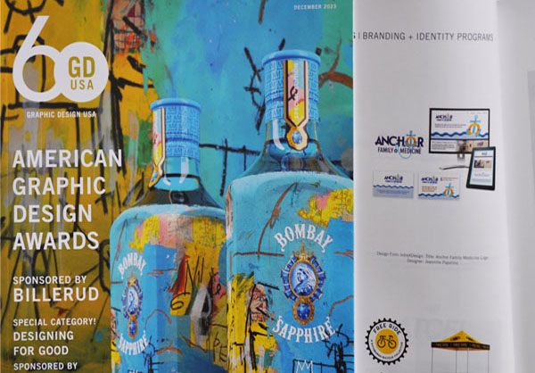
Graphic Design USA Magazine