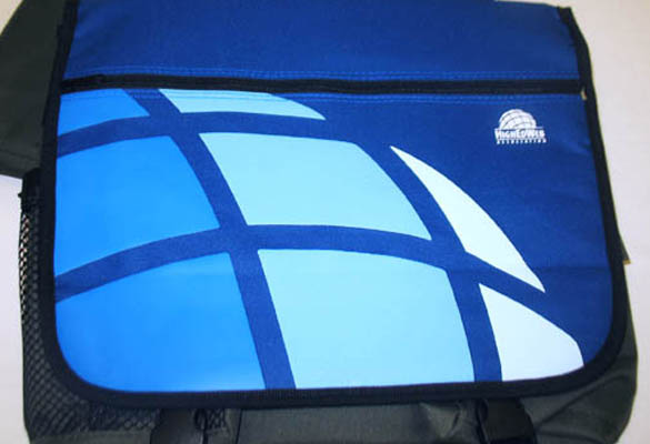
Case Study: A Nonprofit Identity Supporting Higher Education Globally
Challenge
As colleges and universities first started coming together through web technologies and personnel, the need for a community nonprofit formed the HighEdWeb Association. The association embodies an international community who share ideas, resources, business strategies, and marketing practices, that benefit higher education institutions.
Solution
The symbol that captured the essence of this organization, was a globe. The globe communicated a world-wide community; and captured the essence of this organization’s purpose. Specifically that technologies in higher education rotate on the axis of change. Changes in telecommunications, automation, social media, logistics, and creative marketing strategies—frequently pivot whenever innovation advances.
The shaded globe adds dimension to the graphic to emphasize world-wide support. The colors of the blue and black were chosen because they have strong meanings like security, reliability, responsible, confident, calmness, and tranquility. These bold colors give strength to everything this association embodies. The thickness of the font was chosen to act like pillars which uphold the weight and importance of this organization.
Results
This brand has been an international nonprofit organization for over 20+ years. The identity has become the symbol of trust in its industry.