
As a graphic designer, I’ve learned that disruption is simply part of the job. No…
A City’s Structural Icon Becomes Art
Last year, I introduced a graphic illustration—the first in a series I plan to create with icons from around the city of Utica, New York.
If you read my article last year (see link below), you may recall the city of Utica was energetic and undergoing a renovation period to change the city’s downtown urban area.
With gradual improvements underway, the city has started to revive and populate segments of its downtown district with new businesses and popular franchises.
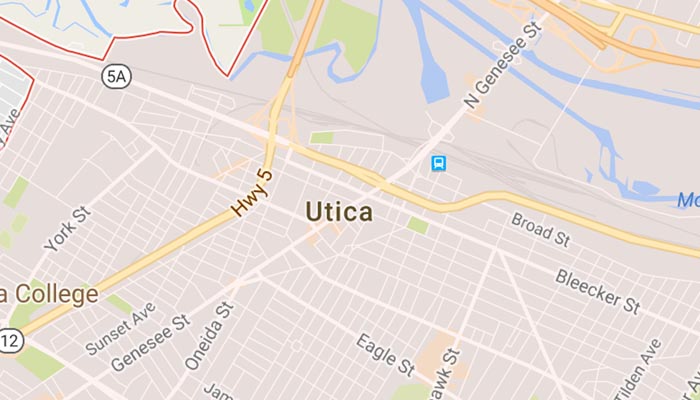
 Like any urban city, Utica has its own historical icons which are recognized by the local community.
As an ambitious project, I’ve taken these icons and replicated them—creating graphic illustrations that spark a new interpretation to these historical structures.
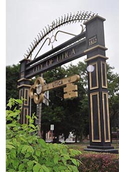
The next image created in my series, is the archway that sits at the entrance of downtown Utica.
Why The Archway? In most small towns the downtown area is where the heart and sole reside. It’s where the Utica area has seen the most economic development over the past year. With the Mohawk River flowing through the city, Utica is located directly off the the New York State Thruway, and between Albany and larger cities like Rochester. The archway was chosen simply because the key symbolized a new vision for the city and the possibilities the city has yet to unfold. The broader vision for this area, will expand current eating venues, add small shops, create more hospitality stays, and include residential lofts and community meeting spaces.
Creating The Illustration
 Every illustration starts with a a pencil drawing. As the artwork takes shape, special software allows me to manipulate the colors, tones, and brightness of each structural element. By using software, I’m able to alter the image to achieve the results I want—something nearly impossible to do with other types of media.
While it’s typical for the illustration to undergo many different iterations. Each artistic decision builds on the graphic that completes the image. Some artistic decisions work, while other decisions require a new approach.
Here’s an example.
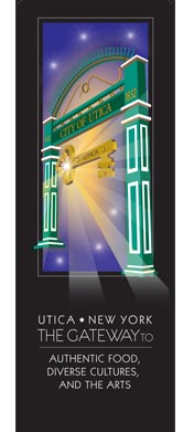
The arches in this illustration were originally yellow (mainly to mimic the reflection of sunlight); but the color was changed because the yellow sparked a parallel to McDonald’s Golden Arches. Green was chosen instead because the arches were originally painted green—prior to the black archway pictured above.
The challenge often lies with creating harmony among the colors, accentuating the structure’s perspective, and enhancing the details that make the icon recognizable. With all that said, this particular image needed to emphasize the archway. As the Gateway to the Adirondacks, Utica’s uniqueness offers much more then its central location . . . like authentic foods, diverse cultural events, and the arts.
As for the illustration, the easiest way to express the progression of the artwork is to equate it to reading a novel. When the illustration becomes more defined, the detailed being to reveal the final rendering. Sometimes minor adjustments can lead to unexpected surprises. The result is only revealed—suchlike a novel’s ending—when the last artistic action makes the illustration complete.
Only then . . . do I consider the artwork finalized.
(Request for copies of my posters can be arranged by contacting me directly)
An earlier article and poster can be seen on my blog.
Related Posts
Comments (0)