
As a graphic designer, I’ve learned that disruption is simply part of the job. No…
A City Transforming Its Brand—Refocused, Renewed, Revitalized
Have you ever known your favorite product or service to undergo a change? That change might have come from your perception that something familiar is now different. It could have come from its taste, labeling, or messaging that might have caught you by surprise. While it’s not uncommon for brands to transform themselves; the reason for change comes from a desire to remain competitive and to increase a brands standing in the marketplace.
But it’s not just products or services that undergo a change; bigger venues do too. Many cities, across our nation, work yearly to achieve the following results:
• improve economic environments
• foster business opportunities
• bring communities together through nonprofit causes
• support festivals and entertainment venues
One such community in Upstate New York is currently redefining its marketability. The city of Utica, New York, is pointedly focused on its own Renaissance Plan. New projects are currently underway to draw families, businesses, and entrepreneurs to this area.
If your familiar with the Mohawk Valley region in Upstate New York, or you’re just hearing about this region now, there’s an energy in play that’s focused on transforming and revitalizing the city of Utica. This renewal effort has been on-going for over a year, but the efforts to bring the city more jobs, increase retail and business opportunities, and bring leisure activities to this area is growing. While the west coast has long been nicknamed the Silicon Valley, Upstate New York is slowly gaining recognition as the Tech Valley of the Northeast.
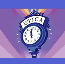
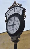 To promote the area’s new found spirit and participate in the city’s renewal efforts, it was only fitting for me to create a graphic from a well-known city icon—the long standing street clock. I chose this icon because:
• the city’s name is prominently displayed at the top of the clock
• the clock is accented with 19th-century decorative architecture (reminiscent of immigrants who’s handiwork filled this city with pride)
• the clock by its very nature is a representation of time—time gone by, time in the present, and time yet to come
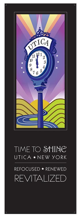 For this reason, the clock was the perfect symbol for this project. Recreating the clock involved adding symbolic references to personalize the area’s unique location. These included:
• the wavy blue lines to symbolize the Mohawk River running through Utica
• the arced shape of the mountains symbolizes the region’s agriculture and rolling plains
• the rising sun and rays of light represent optimism for the future
If you look carefully at the poster, you’ll identify arched mountains with a modernized “M” standing for Mohawk. The dip between the mountains is shaped in a “V” representing the Valley. The clock’s architectural structure required each shape to be crafted individually; allowing all the pieces to have a specific color to define its dimension. The slogan, “Time To Shine, Utica, New York, Refocused, Renewed, Revitalized” captures an indescribable spirit where growth and prosperity comes from the optimism this city has envisioned.
When the poster size image was completed it was entered and accepted in a local juried art show hosted by Utica’s local museum. Through this event, the community was able to view the image for a period of a week. With Utica’s future focused on technology, rebranding the city’s marketability has already got the hands of time pointing to Utica . . . as it’s time to shine.
(Request for copies of this poster can be arranged by contacting me directly).
Related Posts

Comments (0)