
When was the last time you took a road trip? One where you roll down the windows, let your brain wander, and actually look out the window instead of refreshing your mobile's inbox?
Case Study: Logo Design For Treehouse Reading and Arts Center
A New Business Owner Starts To Envision Her Store
Starting a business requires careful planning, a passion for your work, and the drive to pursue a lifelong dream. When Dr. Joanna Robertson first envisioned starting her own business, she knew she could enrich the lives of many of her students. As a literacy professor, reading tutor, music teacher, arts educator, and children’s literature expert; she felt she could use her skills and experience to support children within her community.
When an opportunity arose, Dr. Robertson thought more about the special programs she’d offer to preschoolers through adolescences. She knew the power of literacy, learning, and the arts, would offer her students many different educational options. She also knew a section of her business would include a children’s bookstore; offering different reading options for her young visitors.
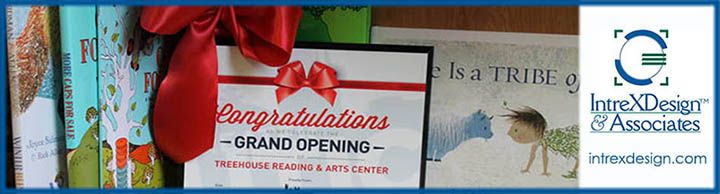
As Dr. Robertson thought about her business name, she liked the word “tree house” since it’s symbolized children, play, and growth. After much thought, she chose to name her business, The Treehouse Reading and Arts Center, located in New York Mills, New York.
Dr. Robertson then turned her attention to thinking about her business logo. Knowing she’d need assistance with her logo, she turned to another business owner she knew—Jeannine Papelino as the owner of IntreXDesign & Associates—to create her business identity.
Project Objective: The Reason A Tree House Needs To Be The Logo
Before launching her small business, Dr. Robertson explained to IntreXDesign & Associates how she really liked the symbolic meaning of a kid’s tree house. She felt the graphic could capitalize on a child’s unique place to play and read books. She liked the concept that a tree symbolizing growth could tie into her engaging programs, creative activities, and reading and writing sessions. After listening carefully, Dr. Robertson’s reasoning seemed ideal as a symbolic logo, and Jeannine started thinking about ways to sketch her ideal logo. Given a tree house could easily capture a child’s environment, the logo had to be playful to include activities often around a tree house. It was also important that the name, The Treehouse Reading and Arts Center, and logo, resonate with the audience she intended to grow.
Design Approach: Create A Logo With Engaging Kid Activities
For IntreXDesign & Associates, capturing the spirit of a kid’s playhouse required adding enough detail to communicate a tree house, while keeping the logo simple and definable. We first started with a sketch. Adding some simple details to enabled the concept to take shape.
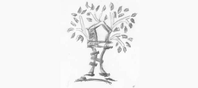
The sketch was refined to make the illustration into a graphic, adding more detail to an upside down open book which served as the roof. After some additional refinements the identity emerged creating a child-like icon for her logo. The font chosen needed to be simple, bold, and work as though the letters became part of the tree. The “H” in the font needed to mimic a latter yet still be readable as the letter H. A different font was used for the words “reading & arts center” to keep the words playful and look as if the words were hand printed. As the graphic developed the decision was made to make the word tree house one word, since one word worked better to define the letter “H” as a latter.
The finished logo below, is more refined than the initial sketch. The “H” visually comes across as a latter and the swinging tire captures a playfulness about the graphic that works so well. Balancing the right amount of detail does keep the graphic simple and easily definable as a tree house.
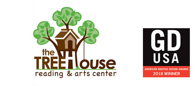
The brand colors were an easy pick of green and brown to symbolize nature and growth—like childhood learning and advancements. The color green was chosen because it worked well as a dark shade for the leaves and a lighter shade for the brush. The dark brown color was chosen because the shades give dimension to the house, book at the top, tree branches, and blends nicely into the text acting as the trunk of the tree.
In December 2018, Graphic Design USA, a national resource for creative and design professionals, recognized IntreXDesign & Associates, in their annual design competition for the creative identity of the Treehouse Reading & Arts Center logo. The 55th Anniversary Print Edition is a 200-page GDUSA Design magazine where IntreXDesign & Associates received recognition of the award under the category of brand identity.
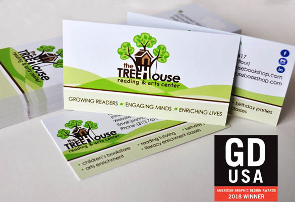
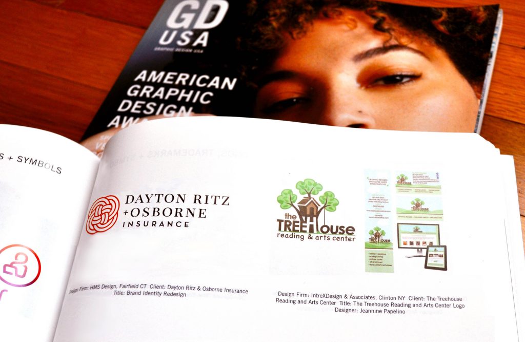
Once the logo was completed, business cards, and a website were developed to add more character to her brand. The rolling hills with its mix of shaded green pastures adds a whimsical feel to the brand’s identity. The playful tire swing keeps the graphic cheerful and fun.
The Result: A Whimsical Treehouse Logo Inviting To Kids
With an identity that is unique and recognizable, there’s a reassurance for this new business owner that promoting her educational services within the community will stand out. As Dr. Robertson’s promotional material and messaging increases, the benefits associated with an exclusive identity will continue to add noteworthy prominence to all her marketing material.
“And a big thank you to IntreXDesign for the amazing logo and design work for all aspects of my business! You have been incredible!!!”
—Dr. Joanna Robertson
If you’re a start-up business in need an identity, or you’re rebranding an existing business ask IntreXDesign & Associates for a free estimate. Or check out other creative logos we’ve designed businesses and nonprofts.
Related Posts

Comments (0)