When was the last time you took a road trip? One where you roll down the windows, let your brain wander, and actually look out the window instead of refreshing your mobile's inbox?

How To Design A Memorable Logo That Connects With Your Audience?
So, what makes a good logo?
It’s a common question most business owners ask themselves. Followed by, will my logo resonate with my customers? Creating a logo for a business is certainly a big step. Probably one of the most important decisions business owners make after deciding on their business name.
Therefore it’s understandable when a business owner feels uncertain and asks themselves; am I making the right decisions on my logo?
5 Basic Tips To Creating A Recognizable Logo
Let’s start with the basics.
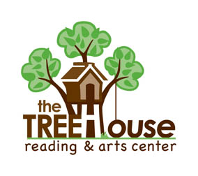
1. Your logo should be recognizable. When possible, use a symbol or icon people are familiar with—it’ll make your business more memorable. A client of mine, asked me to create a logo for her and include a tree house—which was the name of her business. This offered her a distinct advantage, since it was a symbol already tied to a childhood icon. To further understand our approach and process to this identity, visit the Case Study: Logo Design For Treehouse Reading And Arts Center.
When it’s not possible to use something familiar, you’ll need to increase your marketing so people become familiar with your brand.

2. Your logo should be simple. An identity should be simple, and the idea clearly understood even upon a first glance. It’s structure should be symmetrical if possible, and balanced proportionately in weight relationships. The Kritter Sitter Logo I designed is a good example of a simple and symmetrical logo. The four quadrants are equal and the business name is tucked closely underneath the eves to becoming part of the logos structure. My client asked me to capture exactly what they do and my creative process details the approach on my Kritter Sitter brand identity page.

3. Your logo should have limited colors. When adding colors to a logo, it’s best to choose 2 or 3 different colors. Each color should look nice and compliment each together. Think about the hue values like a dark and medium tone for each color—or different shades of the same color. This will enhance the logo with a little dimension—making one color stand out and the other recede. Colors can also have meaning, as in the case of this logo. The black and blue were chosen for specific reasons, as revealed on the HighEdWeb Association logo brand page.

4. Your logo should reproduce well at any size. As a graphic your logo should be easily understood especially when enlarged or reduced in size. Sometimes using a variation of line weights can add more interest to a logo. In the case of this Well•U logo I altered the “E” to make it look like a person running. The graphic worked really well since the varying line weights made the letter “E” look like a character. Keep in mind a graphic that’s well designed will almost always reproduce better than a character illustration—simply because there’s less detailed lines. As noted in the Well•U brand page, the logo has an “active” character, which makes it work so well as a health graphic.

5. Your logo could be a wordmark. The use of a wordmark is an alternative solution to a graphic logo. Adding a unique character to the letters can add enough interest to make the graphic distinctive. In the case of Sofo Decorative Finishes, the artist wanted to integrate a piece of her artwork into the wordmark. Since the word “Sofo” was the main identity, the reasons why we added her artwork made sense. The image selected simulated the curved font to make the entire wordmark cohesive. A summary of this artist’s reasoning can be read our our Sofo brand identity page.

“When creating a logo, try to use something familiar like a word, symbol, or color with a symbolic meaning. A logo that cleverly capitalizes on existing references, will provide leverage for a business’s unique advantage in their industry.”
—Jeannine Papelino, IntreXDesign & Associates
Creating Your Memorable Identity and The Questions That Follow
The goal when creating a logo is to make it recognizable, memorable, and distinguishable from any other product or service in the marketplace. These 5 basic tips should provide answers to your question what makes a good logo.
When you’ve considered all options, remember creating a memorable identity might be worth an investment. On the plus side, it’s a business write off and creating a customized logo with a professional designer can ensure your logo is headed in the right direction. If you’d like to consider this option, IntreXDesign & Associates would be happy to provide you an estimate. Our Project Brief form is easy to fill out and our commitment to reply to all requests comes in a couple of days.
Once you settle on an identity, you’ll want to maintain the graphic on everything that represents your business. The reasons why you’ll want to retain your logo can be found in our article, Can I Change A Logo And Use It?
You may also wonder if you need to trademark your logo. Under intellectual property law, there is some protection. But understanding those differences between copyright and trademark law might be beneficial. For further information, start with our article, Do I Need To Copyright Or Trademark My Business Name Or Logo?
As mentioned above, IntreXDesign & Associates can provide you an estimate on creating your logo—start with the button below.


Comments (0)