The Kentucky Derby is a horse racing event held the first weekend in May in…

Literacy Coalition: Reaching An Audience In Need

Case Study
The Literacy Coalition of Herkimer and Oneida Counties, is a nonprofit organization located in Upstate New York. The organization’s mission supports the community through resources in reading, writing, basic skills in problem solving, and speaking the English language.
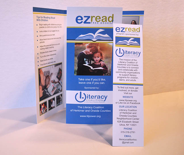
Project Objective: While most of The Literacy Coalition’s services are done through community outreach, word-of-mouth, and volunteers, the organization wanted a marketing brochure to promote their services among community locations that target their audiences. A bookmark was also requested and designed—as a promotional resource—with the idea that it could easily be distributed among trade shows and book fairs.
Our Process and Creative Approach: One of the challenges in creating this marketing piece, was finding a way to integrate two different logos on the front of the brochure and bookmark.
Since each logo’s presence required equal attention, both logos had to be similar in size and distinct. The goal was to represent each aspect of the Literacy’s outreach program respectively, while keeping the logos separate and unified on the front.
For this task, I placed the “ezread logo” at the top and created a book graphic that underscored the essence of reading. To draw a further connection to reading, I placed an image on the cover of the brochure that showed two children with a book.
I choose a similar font used in each logo for the brochure’s cover text, and made the text white so it was noticeable. I picked up the bright blue color from the logos and repeated the color for the background on the brochure. I then added the Literacy logo behind a white background so it was distinct. The bright green and blue made the entire cover stand out. On the inside of the brochure, I included additional photos and text supplied by the Literacy Coalition with the same font and color combination.
On the bookmark, more text was needed. This meant that the size and format required a different approach. I kept the design simple with black text and used a light blue tint at the bottom to highlight where readers can find more information. The bright blue and green colors were repeated as accents to match the brochure.
IntreXDesign & Associates then handled the printing and delivery of both marketing pieces.
The Result: The members of the Literacy Coalition were impressed with the quality of the marketing materials and were glad to have materials they could share at local events. The printed pieces offered a reassurance to the Literacy Coalition that furthered their mission and built awareness for all the good work the Literacy Coalition offer their community.


Comments (0)