A follow up to our article, What's Information Design? And Why Should You Care? This…

Missing Something?

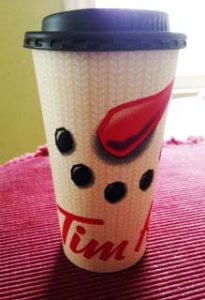
I have to admit, this Tim Horton’s cup bugs me. I’m sure you can see why. As a graphic designer there are some things that just seem to go together like eyes, nose, and a mouth. I think the concept is nicely done since the top of the cup comes across as a really neat top hat. But where, oh, where are the eyes?
The idea behind this decorative cup, is that the snowman’s eyes become the eye’s of the beverage drinker. It’s a neat concept, but in order for the cup to make sense an individual needs to position the cup straight on to align the cup’s nose and mouth to their own eyes. Not everyone gets this concept, which defeats the design idea.
The purpose of a decorative cup for the holiday season is to add a bit of cheer amidst the hustle and bustle of seasonal mayhem. For me, I’d rather see a twinkle in the snowman’s eyes smiling back at me as I enjoy a favorite beverage and relax with some solitude.
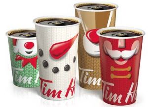
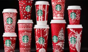
Tim Horton’s is not the only coffee house which has taken on a seasonal redesign of their cups. Starbucks has always included holiday cheer in their signature cups dressed in red, white and green .
This season, holiday beverage designs have caused some patrons to Instagram or Twitter their cutest cup picks—choosing between Tim Hortons or Starbucks. I guess, in this case the true answer in holiday cup designs, is in the eyes of the beholder.


Comments (0)