The Nauset Lighthouse was constructed in 1877, and is listed on the National Register of…

Creating The Kentucky Derby Graphic Illustration
 The Kentucky Derby is a horse racing event held the first weekend in May in downtown Louisville, Kentucky. The two-day event brings lots of people and an extravaganza of fashion and hats for an unforgettable weekend.
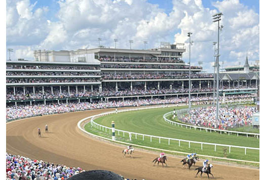
When an opportunity to attend the Kentucky Derby at Churchill Downs presented itself, I did not hesitate to make the trip.
When I arrived at Churchill Downs there was so much to see and explore. The excitement of that day made me ask myself, “What if I were to create a graphic illustration to capture the festivities of this day?’’ But in the midst of all the excitement and interesting sights around me, I wondered how difficulty it would be to choose a specific subject. So I decided to keep my eyes open for some inspiration that would spark a new illustration.
Choosing The Image To Illustrate
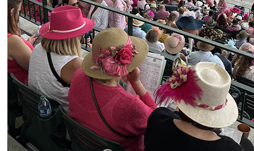
As the day went on, I continued to look and watch the horse races. I walked around so intrigued by the hats and fashions that the day flew by. Every time I came back to my seat these women in front of me were my focal point. After awhile it dawned on me. Could I capture their hats, attire, the track, and the Churchill Downs building in an entire composition? Maybe that’s my illustration? So I photographed the image a number of times to decide at a later date.
 When I returned home I wavered about my biggest challenge—how can I successfully create a crowd to capture the excitement of the Kentucky Derby. I reviewed all my photos and finally decided to create the three women who sat in front of me. I chose this image for a number of reasons:
- Their decorative hats capturing the spirit of the Kentucky Derby
- Their color choice connected them visually in composition
- The emotion of this image is relatable given the patron is undecided about her horse entries
- The track and icon of Churchill Downs made a nice background (not pictured in this image)
Together it was everything I wanted my illustration to capture.
Creating the Illustration
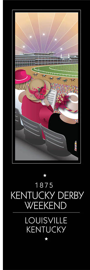
 After deciding to try this image, I faced a tough challenge. How could I simplify the crowd pictured in my photographs? As I worked on the illustration and tried a number of different creative solutions, my concerns diminished. I decided to create a sea of colorful circles, all clustered together to mimic the large crowd. With this approach I was happy with this result. I felt assured my toughest challenge was behind me. The next hurdle was artistically nailing my subjects with the details of these women and their hats.
This was the fun part. I love how the details in my illustration capture the story I want to tell. As I designed the iconic Churchill Downs in the background with the horses racing on the track the image started to come together. This told my story from where I was sitting. As I worked on creating the entire illustration, I took into account proportions and distances to ensure elements were properly placed. Adding the colored rays of light and stars brought a bright and cheery feeling to this spectacular event.
The illustration stayed true to the photograph, even capturing the indecisive patron studying her horse entries. This small gesture became relatable, and the composition of the image almost places the viewer at the event. The more I played with the shapes and composition the more I was happy with the results. I was feeling more comfortable this illustration was a keeper.
When the illustration was complete, it told the story I wanted to tell. The illustration captured the day’s emotions from the exact vantage point of my seat. Through the angled composition a viewer is invited to see what I saw. Quite possibly even understanding what ignited the spark of inspiration that became my Kentucky Derby Illustration.


Comments (0)