Every business, strives to build brand awareness. But equally important is establishing name recognition. When…

What Can 4,000 BC Relics Tell Us About The Art Of Communication?
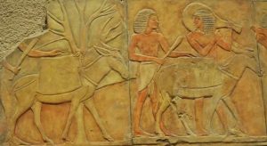
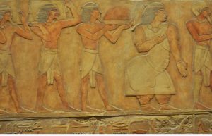 While traveling in Canada this summer, I visited the Royal Ontario Museum (ROM), in Toronto. The ROM featured an exhibit of Ancient Egyptian culture related to the Ptolemaic times with artifacts like human figures and animals carved in stone.
As I studied these relics, it was clear to me its creator chose to use simple lines and forms to illustrate their story. Upon closer inspection, it was obvious the artist consciously varied the line weights in their illustration. The emphasize from thin to thick suggested shadows and 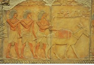 delicate details like eyes and jewelry. Even the density of the objects are distinctive as seen in the thickness of the tree trunks, animal mass, and shape of human muscles. The creator also added subtle attributes like wavy hair and hand-held objects expressing intervals of action. Yet the stone itself reveals the creator’s steadfast commitment to carefully strike the right balance between subtle artwork details; and the necessity to be clear and descriptive when communicating their pictorial tale.
 The same is true for the image at the right. The illustrations are strung together as pictorial sentences. Yet each image is carefully balanced and spaced among surrounding objects to support visual clarity.
The Egyptians weren’t as archaic in their messaging as we might think. Ironically, the Egyptians were perceptive enough to realize that communication requires clear and concise messaging. Today, our message is usually tailored to specific markets. Whether the story is 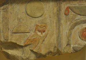 told through video, written words, or graphic illustrations—the same goal parallels the Egyptians—the message needs to be simple and easily understood.
As I studied these images, I couldn’t help but relate it to my own profession as a graphic designer. For instance, when tasked with creating a logo for a new business, I may start with an illustration and find myself simplifying the graphic to create simple shapes and forms. Weight relationships like size of graphic to type proportions need to be equivalent to create aesthetic appeal. Too much detail will make the graphic hard to understand and even difficult to reproduce. Therefore, my goal is to create the right balance using objects, space, and typography to support a visual graphic that’s easy to understand and visually appealing.
Clearly the Egyptians were advanced in their approach to basic design. Perhaps it’s 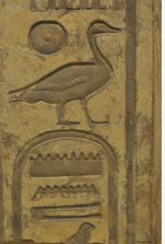 evidence that history, as seen in these 4,000 BC relics, has influenced our modern world. The basis of good design and marketing starts with capturing an audience’s attention. It’s undoubtedly the visual message the Egyptians relied on to communicate their pictorial story. Today, after centuries of time gone by, these stone relics continue to draw huge audiences. With that said, it’s not surprising the ROM’s exhibit leaves viewers to ponder—with some curiosity—the ancient meaning behind the creator’s illustrative message.


Comments (0)