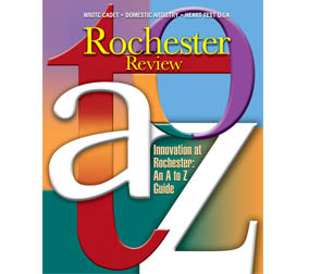
A to Z Magazine Cover
Project Objective
Create a cover design for the University of Rochester’s alumni magazine, to highlight their feature story, Innovation at Rochester: An A to Z Guild.
Our Process and Creative Approach
Creating a cover solely designed with type was fun and challenging. It required adding some dimension to the text and choosing the right color and tones to make the graphic an art piece. Playing around with the type to overlap and read easily required a bit of creative thinking.
The Result
The cover design offered the right balance of design elements: size of type to portion of text, and shades of color to dimension of special effects. This cover became the first typographic cover to be created for the University’s alumni magazine.

